Sunday 30 June 2013

Mara #5 - Review

Mara #5 (of 6)

Publisher:
Image

Publication Date:
June 2013

Writer:
Brian Wood

Art:
Mind Doyle

What Image says about this issue of Mara...

Everything's on the table as far as the military's position on Mara, but who's the one with the nuclear option? How much power can one woman hold before the world says "enough"?

What can I expect from this issue?

A Brian Wood type of superhero comic book. Wood has created a very different type of Superhero in Mara. She has extraordinary powers and has been on a journey to discover exactly how much power she yields. But more than that, Mara is trying to understand what it means to her to hold such power. Wood explores what happens when two powers (Government/Military and Mara) collide. This is a story of power, isolation and threat.

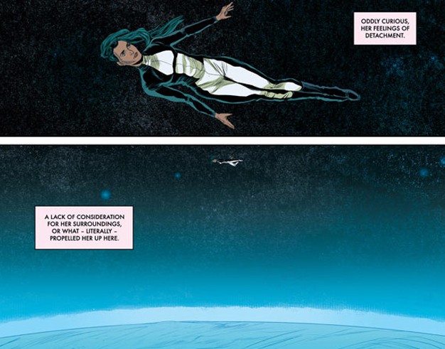
There is a calmness to this issue due to there being little dialogue (mostly narrative) as well as art work that gives the reader a real sense of Mara's space and isolation. Wood and Doyle succeed in providing the reader with a perspective on Mara as a non-typical superhero. Doyle's art really allows the reader to experience Mara's indifference to the people of Earth as she struggles to deal with the power she now has and how it has impacted on those around her (her brother).

This is a clever book and really invites the reader to empathise with Mara's situation. Even though at the end of this issue you know the power she yields presents a danger to others, you still feel Mara is in the right and that those innocents on Earth do deserve what she is about to unleash on them.

Mara is one of those comic books you will read and make sure stays in your permanent comic book collection. I can't wait for the final issue next month. This has been a fantastic comic book series by Brian Wood and Ming Doyle.

So what did others think?

Comic Vine has this to say...and it's all good news...

Comic Vine Review

Newsarama provides a really good insight to this issue and this series...

Newsarama Review

Geeks Unleashed had a little to say about the awesomeness of Mara too...

Geeks Unleashed Review


So what do I give this issue?

9 out of 10 folks. 

C.


Thursday 27 June 2013

Lazarus #1 - Review

Lazarus #1

Publisher:
Image

Publication Date:
June 2013

Writer:
Greg Rucka

Art:
Michael Lark

This is what Image says about Lazarus #1...

The World now lies divided not amongst political or geographical boundaries but amongst financial ones. Wealth is power, and that power rests with only a handful of Families. The few who provide a service for their ruling Family are cared for. All others are Waste.

In each Family, there is one person given the best they can offer, training and technology and assets, every scientific advantage. This person is named their Family's sword and shield, their protector, their Lazarus.

In the Family Carlyle, the Lazarus is called Forever. This is her story...

So what can I expect?

An explosive masterpiece. When I first heard about this series being published I knew it would be one to look out for. The first 4 pages set the scene for our main character Forever, the Carlyle Family protector. She is immersed in a world of violence all in an effort to protect her family's vast wealth.

We are shown a brutal post-apocalyptic world where most of the population simply do not matter. People are forced to kill for food. The production and accumulation of food is where the battleground appears to lie between the Carlyle and Morray families for the moment. The Morray Family appear to have infiltrated the Carlyle harvesting facility.

There is a betrayal in the Carlyle Family Harvest facility and Forever is charged with the responsibility as her Family protector to restore justice...if you could really call it that!

So what did I think?

Just Brilliant! The opening panels and story introduce you to a world of wealth, extreme poverty, horrific violence and survival. The art by Lark successfully reinforces the brutality of the world as it exists in this post-apocalyptic world. Justice is dispensed by families of power and wealth rather than courts of law. The Family is the law and a person only means of survival.

In this dystopia, Lark uses dark blue and green tones to reinforce the coldness of this world. Lark is successful in using facial expressions to tell the story of Forever's emotional struggle with her conscience and how she must reconcile this with her sense of family duty. The story reveals more of itself as the dialogue between Forever and Jonah (sister and brother) progress throughout the book. What is revealed about Forever's state of mind needs to explored by you, the faithful comic book reader...no spoilers here!

The art by Lark really has you staring at the expressions cast by Forever in each of the panels where she is forced to examine her conscience. The art really brings out an uneasiness in her view of what is happening around her. Rucka keeps this story faced paced and exciting. The writing is focused on bringing out the emotion in each of the characters and Rucka does it brilliantly.

The cover of this issue (pictured above) is what really drew me to this issue this week. I saw the cold blue and green tones, black hair, the bullet wound and it just caught my attention. I knew I had to give it a read...and so should you...this may just be one of the best series to emerge in comic books this year.

So what did others think?

Comic Spectrum and I think alike, this book is exceptional...

Comic Spectrum Review

This is a great review and well worth a read...

Newsarama Review

This book is the pick of this week and any comic book collection must have this issue.

I am so looking forward to issue #2.

So what do I give it?

10 out of 10...this may end up being the best comic book series I will read this year.

Do yourself a favour...head to a comic book shop and get a copy of Lazarus #1 before it sells out...and it will sell out.

C.

Thursday 20 June 2013

Robyn Hood - Wanted #2 - Review

Qualano Dinapoli Cover
Robyn Hood - Wanted #2

Publication Date:
June 2013

Writer:
Pat Shand

Pencils:
Larry Watts

The story so far...according to Zenescope...

Wanted for murder and on the run from the authorities, Robyn travels to New Jersey in search of her father. Hoping for insight into the night she was left on his doorstep, Robyn confronts him, unaware that the cops have her cornered! As she is taken into police custody, Robyn remains in the dark about the terrible threat hanging over the city that she once saved.

What did I think?

Cover A - Ortiz and Dinapoli
I was not really taken by this issue. It does not seem to have the same impact as issue #1 of Robyn Hood - Wanted. I did start to get bored throughout the issue because the story appears to lack depth. As I read through the issue I found myself wondering whether we were going over old ground again. 5 part mini-series comic books have to be punchy and must get to the point. Story development for mini-series have to move at a good pace, and in this issue the pace seems slow.

Guy of Gisbourne's pursuit of Maid Marian certainly provides for some interesting reading, but  panels dedicated to Robyn appear to go over old ground with her reluctance to want to return to Myst. This changes at the end of the issue, but no spoilers here!

I really did not like the art work by Watts. It was not bad, Watts is a good comic book artists and knows his way around comic book art panels, but the line work was probably a little too messy for my liking. I do prefer cleaner line work for Robyn. That is more a personal preference for this title rather than a criticism of Watts' work. While I'm on the subject, drawing characters in a very angular way needs to be done well, not everyone can pull it off. Cliff Chiang is the master of this style of drawing (See Wonder Woman - New 52 Version), I was not such a fan of Watts' more subtle style in this issue.
Cover A  - B&W - Ortiz and Dinapoli

'I come for the storyline, but I stay for the cover art.' I can't fault the cover art of this series. Great artistic teams have been assembled to provide the reader with great cover art. I am a huge fan of Cover B by Pasquale Qualano and Ylenia Dinapoli.

I would love to be able to get my hands on some of the exclusive covers for this title but as I live in Australia I will have to pay 2 to 3 times the normal price to get one...I'll settle for the standard covers for now, they are all remarkable, even the Watts cover (Cover C). In fact the Watts cover gives you a better appreciation for what you will encounter as part of the story in this issue.

What did others think?

Well, I was a bit down on this issue, but other reviewers had different comments...
Cover C - Watts Metcalf

Unleash the Fanboy Review 

Fanboy has a point, Avella was the highlight of this issue and in my opinion the more dominant female character.

Read Comic Books Review 

This is another really good review...I'm starting to wonder if there is something wrong with me...I was not this glowing in my opinion of this issue.

Comic Bastards Review 

Yep, I think there is something wrong with me, if Comic Bastards say it's good, it must be good...they don't usually get it wrong.

So What Do I Give It?

Maybe I was having a bad day, but I expect so much from this great character. Maybe I am expecting too much, but I give it 6 out of 10.


C.

Monday 17 June 2013

Kick Ass 3 #1 - Review

Hughes Cover
Kick-Ass 3 #1

Publication Date:
July 2013

Writer:
Mark Millar

Pencils:
John Romita Jr.

Dave Lizewski always wanted to be a superhero. Now he is one. And his mentor Hit-Girl is now in Jail.

What can we expect from this issue?

Lots of good story development but not a lot of violence. I'm sure that will come soon in future issues. Rest assured it will come, we are just building up to it in this issue.

I really should have read this issue prior to reading any other comic book from this week's new releases. It is brilliant. Coming off the back of the mini-series Hit-Girl, we see Kick Ass faced with a whole new challenge...busting Hit-Girl out of jail.

Hit-Girl given her circumstances is forced to trust Kick Ass and his colleagues to handle the jail break. I certainly won't spoil it for you, but I will say it is hilarious and completely in keeping with the style of humour Millar has delivered in the last two Kick Ass series.

What did I like about this issue?

Everything. John Romita Jr's. art is unique. I hear a few comic book geeks say from time to time that they dislike the way he proportions his characters...but that's Romita's style. Millar delivers a humorous issue and I loved all the Batman references.

When I picked this issue up off the shelf I was surprised to see so many variant covers. I like to collect the variants if they are by artists I like (I'll save that discussion for a whole other blog entry), however there were just so many. It wasn't until I started to read it I realised that all the variant covers together state ' Evil prevails when good men do Nothing - Justice Forever' (see image). They would look great displayed side-by-side. If only I had a bigger man-cave. 

Another aspect of this issue is that you probably don't need to bother with reading the past series unless you really want to. This third series starts out pretty user- friendly and if you roughly know what the story is about you will still enjoy it. If you're new to the Kick Ass concept then don't be frightened to jump in at this 3rd series.
 
What did others say about it?

Mostly good things. Here are a few reviews that I thought were a good read...

Read Comic Books Review 

Comic Vine Review 

What do I Give It?

8/10

Get onboard with Kick Ass, you will enjoy!

C.


Friday 14 June 2013

Richard Moore's Macabre #1 - Review

Cover
Macabre #1

Publication Date:
May 2013

Story & Art:
Richard Moore

This black and white comic book by Richard Moore titled Macabre brings us comic books geeks three mini-horror tales, as well as shows off the artistic talents of Richard Moore. The book is published by Antarctic Press Entertainment and is suggested for mature readers only. It aint a kids comic book folks...no superman here!

What can I expect from this issue?

At page one we are introduced to Charli (also featured on the cover). Charli speaks to the reader personally as if to provide the reader with a tour of what happens throughout the book. The comic book as a package provides a great balance between story telling and unique art. Moore has the reader really wanting more by the time you reach the end of the comic. I think my only criticism would be that the horror-tales are so short that they come to an end just as you are starting to get into them.
Macabre #1 - Page 1

Moore's art is an acquired taste I found, but once I delved into the issue I couldn't get enough. A very obvious observation is the way Moore draws the very large eyes on his characters. This approach to his characters certainly gives them a 'darkly whimsical' look. I am yet to warm to the way he draws noses, they just look too wide and brutish. That said, all his characters look great. There is a double page drawing of Charli that proves to the reader that Moore knows how to draw.

When looking at this week's independent new releases, I was not sure whether to pick this title up. Having decided to give it a go, I have to confess that I am a Richard Moore convert. I love it and so will you. Just give it a go. This is one independent artist you should support.

Macabre #1 - Page 13
Moore is clearly generous when it comes to showing his art to his readers.
 
All of the images I provide you in this blog are taken directly from his web page and feature in the issue itself. Check it out...

Richard Moore Art

After exploring his website I am keen to read Boneyard. I'll give you my thoughts if I do.

What have others said about this issue?

This is the only review I could find...

Eat@Shrimpy's

What do I give this issue?

8 comic geek stars out of 10...really, it's the art that you will love, but for the price of $3.50, you probably could have expected a bit more.

Enjoy 

C.

Wednesday 12 June 2013

Fairest #16 - Review

Adam Hughes Cover
Fairest #16

Publication Date: June 2013

Writer:
Sean E Williams

Interior Art:
Stephen Sadowski, Phil Jimenez, Dan Green

Cover Art:
Adam Hughes

The Prince Who Would Be Maharajah - Part Two of The Return of the Maharajah

What can we expect from issue?

Pure brilliance in storytelling, great interior art work and of course the amazing cover art by Hughes. This issue picks up from issue #15 precisely where it left off. The beautiful Nalayani has travelled to see the provincial Maharajah Charming on behalf of her village to seek his assistance to protect her village from the dhole (little wild dogs) and roaming bandits.
Fairest #3

The Maharajah is completely taken by Nalayani and seeks to steal her heart from the moment you turn the first page of this issue.

We are first introduced to Nalayani at #15 a completely new story arc written by Sean E Williams. She meets a friendly fox in issue #15 who befriends her and aids her in her travels to meet with the provincial Maharajah. Issue #15 is an essential read prior to you reading this issue #16. Through the fox you learn that Nalayani cares for the welfare of her fellow villagers, is a warrior (skilled archer), is compassionate and above all truly benevolent.

In this issue Nalayani and the Maharajah are set upon by the vicious dhole and their lives are threatened. Nalayani's skills as a warrior come to the fore but the Maharajah and Nalayani are left stranded.

What did I think?

The art by Sadowski is great. Facial expressions are drawn to suit the characters circumstances and the panels flow nicely. The shades of blue and grey throughout this issue really amplify the intensity of the dangers the two main characters face by the dhole in the dead of the night.
Adam Hughes Cover - Fairest #11

I have always been a fan of Fables and its spin off creations. I think Willingham has a particular vision for the greater Fables concept and this story arc is true to that vision. Every time I read an issue of Fairest I am tempted to return to Willingham's original Fables series which is complex, contains well developed characters, and really brings the reader into the Fables universe. Fables is truly an experience and so is its spin off title Fairest.

The cover art by Hughes has been amazing and consistent throughout the series so far. This cover (top image) is detailed and properly sets the mood of this issue. One of the great things I have come to expect from this title is waiting each month to see what creative cover Hughes comes up with.

Fairest is for mature comic book readers that need much more than just superhero violence to keep them going. It remains one of my 'must-read' titles each month. I have high hopes for this story arc and I believe Williams, Sadowski and crew, and Hughes will deliver a great series. I guess we will see with some four issues to go before we discover Nalayani's fate and that of the Maharajah.

What have others said about this issue?

Silver Snail and I think alike...

Silver Snail Review

For a completely different look at this issue, try read the review by Destroy The Cyborg...at least you will learn what a dhole is?

Destroy The Cyborg

What do I give it?

8 out of 10 comic book geek stars.

About the Artwork

There are images (artists attributed) on this blog entry that are not from issue #16. I only include them to give you an appreciation for the amazing art we have seen so far on the Fairest series.

Enjoy!

C.


Sunday 9 June 2013

Justice League of America #4 (New 52) Review

Cover
Justice League of America #4

Publication Date:
June 2013

Writer:
Geoff Johns

Penciller:
Brett Booth

Chapter Four - The Good, the Bad and the Shaggy


These unlikely heroes have been brought together to defend America from super-human threats of all kinds, but unknown even to them, they are secretly in training to take down the Justice League. These men and women are the world's most dangerous heroes. They are the Justice League of America!

What can we expect from this issue?

I really wanted to review this issue in light of all the talk of what might happen to Catwoman. But first a look at the JLA itself. Green Arrow in a moment of frustration is quick to highlight the obvious about Martian Manhunter. Yes, he was punted from the Justice League and has made his way to the JLA's new line up. I think Manhunter should have stayed with the Justice League but I get that a change always keeps things interesting. The new JLA is well stocked with the familiar; Col. Steve Trevor, Amanda Waller, Green Arrow, Hawkman; Katana; Martian Manhunter; Stargirl; Vibe...and the odd choice of Catwoman. For this issue the bad guys include the likes of Paleface, Professor Ivo and Copperhead among a few others.

The JLA continues to work in this issue on understanding and infiltrating this new Secret Society of Super Villians which has just emerged.

This issue for the most part centres on the fate of Catwoman. Most readers will be shocked by the ending. It was not something I was expecting to happen. No spoilers here!!

What did I like about this issue?


Adam Hughes
This issue shows a remarkably good consistency with the pace of the storytelling in previous issues. They have all been action packed and Johns has not been lazy when it comes to revealing his story to readers, as well as providing us comic book geeks with great cliffhanger endings.

The great use of colours really makes this issue stand out for me. The colours used to illustrate Stargirl and Green Arrow and the Shaggy-Man are appealing and really make the action scenes stand out.

The story so far makes this one of DC's more interesting stories right now. Nothing beats Wonder Woman right now as far as DC titles go (at least in my opinion), but I am really keen to stick with the new JLA if for no other reason than to discover the true fate of Catwoman....seriously comic book geeks, you need to read this issue.

What did others say about this issue?

I generally trust reviewers contributing to Comic Vine. This one is quite good...

Adam Hughes
Comic Vine Review 

This review is bloody hilarious and one I would absolutely recommend that you read. With reference to Catwoman the reviewer remarks:

'Booth's got her zipped up and practical as she continues her attempt to infiltrate The Secret Society of Super-Villains.'

It does speak volumes about the way artists tend to draw Catwoman and to a large degree many female comic book characters. Crave Online makes some humorous observations.

Crave Online 

Melissa Grey also provides a great review and makes particular mention of the story Trial by Fire detailing Martian Manhunter's past.

IGN - Melissa Grey

So what do I give it?

I give it 9 out of 10 comic book geek stars!

I have gone to some effort as part of this entry to provide a range of interpretations of Catwoman through the eyes of some great artists. These images don't feature in the issue as many cb geeks would know, but they are great comic book art drawn by great comic book artists. I have always been a fan of Adam Hughes' work on Catwoman.

Enjoy!

C.

Art Germ - Stanley Lau


Sunday 2 June 2013

Wonderland - Down the Rabbit Hole #1 Review

Wonderland - Down the Rabbit Hole #1

Publication Date:
May 2013

Writers:
Raven Gregory
Pat Shand

What we know about this story...in the words of Zenescope...

'Wonderland's sadistic ruler; the Jabberwocky, has been gaining power form the Liddle bloodline for generations with the intent of shattering the border between Wonderland and this world. Alice knows deep down that this entity is after her family and she must find a way to stop it before her deteriorating psyche gets the best of her.'

The image to the top left is cover art by Keu Cha. It is just stunning.

 My understanding of things! 

The Down the Rabbit Hole series seems to hold the keys to the dramatic events that give rise to Alice Liddle's actions (and its affects on her young family) during the Return to Wonderland series which is where everyone who follows this series started. I recall reading the opening pages of Return to Wonderland #1 back in 2007 and was hooked the moment I started reading it. The dramatic opening just screamed out for a prequel. I am glad it has arrived in 2013. I knew the Wonderland franchise was going to be Zenescope's No. #1 title. So far, it has proven a great success. Congrats to Zenescope.

What can we expect from this issue?

Can I first say that if you are new to comic books, the greater Wonderland series is a difficult place to start your comic book reading. You may find yourself quite confused by the comic panel layout from time to time combined with the application of 'literary nonsense'. If you can overcome these challenges, then you will thoroughly enjoy the Wonderland universe.

So, Alice has returned from Wonderland and is happily married with two children. In this issue it appears her mind struggles to distinguish between fantasy and reality. Her escape from Wonderland was not without its costs to her state of mind, but Alice is working at building a normal life.

Interestingly we see Alice as a warrior in Wonderland conversing with the Jabberwocky as to her future. Later we see her in therapy trying to deal with the horrors Wonderland inflicted on her. At the end of this issue we begin to see this title's connection with the Return to Wonderland series.

I was really impressed with the use of an old clock face which appears throughout the panel art to give the reader a perspective on the time that passes in the story. The final page is just creepy and graphically brilliant at the same time. I loved what the writers and artists did with the clock face and with the final page of this issue.

What about the Cover and Interior art work?

The interior art work is great. The grown-up version of Alice is drawn as we might expect from our understanding of Alice the child. The colours leap out at the reader and really compliment the different periods in which the story is being told throughout the issue.

Let me spend some time on the cover art. I think this is something Zenescope do particularly well. Some readers I've spoken to love the very sexy grown up version of Alice which is a perspective some of the covers play to (see Greg Horn - Cover B). Those who know Horn's work are familiar with his style of drawing...

Greg Horn - Cover B


I however, like the covers that illustrate this series as a horror/suspense series and gives the reader a taste of what they can expect from the story inside the issue (see Cafaro - Cover C). 

Giuseppe Cafaro - Cover C


I am not such a fan of the exclusive covers that tend to over sexualise the characters. This is a horror/suspense comic book series. Keep the art provocative and vibrant sure, but sometimes it gets taken a little too far and has virtually nothing to do with the story itself. I'm no wowser when it comes to cover art, but I do get a little frustrated by the sheer number of covers that Zenescope create for a single issue. There are 7 covers (3 exclusive covers which you can bet an Australian reader will have to pay big money to get their hands on). When it comes to covers and cover art, be creative, but stick to the point.

What do others say about this issue?

Well, there are differences of opinion which is what is great about reading reviews. The following review accords more with my viewpoint:

Unleash the Fanboy Review 

and this review is not as kind as mine...

Adventures in Poor Taste Review 

How do I rate it?

Easily an 8 out of 10.

If you are following the greater Wonderland series', you must read this one too!

Enjoy.

C.